Friday, 2 December 2016

Lifestyle Questionnaire Results

Hello!

After getting my results,I have decided to present them in a different way rather than just typing out the results. In order for them to be easily read, I used Word Document to create charts for the results of each question.

As seen above, the results show that most of my target are females aged 16-19 and are currently in school. I must say that due to the short amount of time, I was only able to ask people in my school who are at the age of 16-19 which resulted to these. 
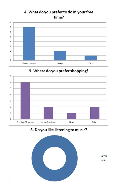
For question 4, there are 6 choices and out of all of them listening to music is the most popular which conforms my target audience. In question 5, I gave my audience a choice of choosing a maximum of 3 answers to broaden my results. Topshop/Topman is the most popular which is a high street clothing brand meaning they sell their stuff at an average price and mostly young adults could afford them. Everyone answered Yes to question 6 which definitely conforms to my target audience.
Similar to question 7, I gave my target audience a maximum choice of 3 to choose from and most have chosen Smartphone/iPod/Tablet,etc. The second popular is Internet which helps me get a clear idea on how to advertise information on my front cover. Most have answered Yes to question 8 which helps with the making of my magazine. Everyone has answered the price range of £3.99-£5.99 concluding that my target audience are not of working class since they chose the cheapest price range.
Similarly, I gave my target audience a maximum of 3 choices for question  10 to get various results. Out of 6 choices, 4 of them were chosen the most. New Articles got the most votes however Well-known Artist/Band, Freebies and Front Cover did not fall for behind with only a difference of 1 vote. Through these choices, it broadens the idea I have for my magazine. I could compile various articles of famous artists/bands and add a freebie on my front cover. In question 11, 7 out of 10 people voted to have brightly coloured font on the front cover which I can consider when making my magazine cover.

For the very last question, instead of  multiple choice answers, I decided to leave spaces for my target audience to suggest any ideas that would make an eye-catching magazine. As a result, I got various helpful points. Most have suggest to have good articles that relates to the magazine's genre such as new gigs by an Pop/RnB bands or new solos released by a Pop artist as long as it relates to the magazine's genre. Others suggested to have bold coloured fonts. For instance, one of my target audience suggested to have a large central image with "bold black text". 

Through this questionnaire, it helped me get a clear idea of what I want on my magazine and how it will appeal to my audience.
Nina
02.12.16

Lifestyle Questionnaire

Hello!

For the next task, we need to create a Lifestyle Style Questionnaire and get 10 people who conform to our Target Audience to complete the questionnaire. I made sure the questionnaire is as clear and concise as possible in order for my audience to give me comprehensive answers I can base my research on. Below is the questionnaire I think would conform to my target audience.


Nina

02.12.16

Tuesday, 22 November 2016

Imaginary Magazine Entity

Hello!

Continuing the planning of our magazine, we have been asked to create a post detailing our intended target audience and a lifestyle profile of our Imaginary Entity. This is to help get us thinking about what my target audience's needs would be and what I should consider in order to meet their needs.

After a few considerations, I have decided to choose Pop/RnB as my magazine's genre. It will be targeted at young adults ages 16 to early 20s. Because I am the same age as my target audience, i feel that I have an idea of what to expect. Below is my Imaginary Magazine Entity:

Athena is a 19 year old university student studying Graphic Design at University of Portsmouth. She is currently taking Graphic Communication because she has always been interested in becoming a graphic designer. Magazine design, publishing branding and design agencies and working in the television and film industries has been Athena's aspirations in life. At a young age of 14, Athena was contacted by a magazine called Local Wolves to be one of their writers for their magazine. (Local Wolves is a magazine that focuses on bringing artists, writers and creative minds together into their artistic community.) Ever since then, she has continuously been looking for inspirations that will help her write articles for the magazine. Watching TV, looking through social media and collecting magazines are the main source of her creativity. Recently, Athena has been stuck on a 'creative block' where she couldn't think of anything to write and nothing has been inspiring her, not even her usual sources. One day, she came across a recently published magazine sold in her local supermarket. Its genre is a mix of Pop/RnB, the type of music she listens to, and they are advertising an advert looking for aspiring graphic designers that are willing to work for their company to design the magazine's front cover for every issue. Athena decided not to miss this opportunity to reach her future dream and grabbed this chance.   


Nina

22.11.16

Tuesday, 15 November 2016

Semiotic analysis of 3 Music Magazines

Hello!

After creating our school magazine for the preliminary tasks, we now have to carefully think of planning and creating our actual magazine. For the next step, we are asked to analyse 3 music magazine which closely relates to the genre of our music magazine.

The first magazine I decided to analyse is the Billboard magazine and its genre is a mix of pop & rnb. The reason behind this is because I am planning to set this genre as the genre for my magazine.


The second magazine I analysed is the Q magazine. Its genre is mainly focuses on rock/pop music. The reason why I chose this is because it is one of my top 3 choices for my magazine.

For my final magazine, I decided to change it and analyse a classical music magazine. 


I learned that there are a lot of codes and conventions that make up a genre of magazine and how it will attract their target audience.


Overall, I have learnt that each genre of magazine has certain codes and conventions that are relevant in order to distinguish the genre. Most importantly, I have an understanding on what I would want (and is relevant) to my desired genre of magazine. However, I did like some aspects from  the last two magazines that I could possibly incorporate in my own magazine, such as the facial expressions and engaging language.
Nina
14.11.16

Monday, 14 November 2016

Contents Page Mock-up

Hello!

The final part of the preliminary task is to make our own contents page mock-up for our school magazine. Contents page contains the features that can be found inside the magazine such as latest gossip, new articles and more. 

For my contents page, i decided to make it simple to match up the simplicity of the front cover of my school magazine. 


Nina

14.11.16

School Magazine Front Cover

Hello!

After a few considerations on what to put on my school magazine, I have finally finished creating my very own school magazine. As seen below, it isn't the best school magazine out there but I did learn something out of this task.

The colours that I chose are blue and red since it is St Gregroy's school logo. I also have decided to use the school's logo name instead of recreating it so the audience recognises the schools's name. There isn't much in this front cover but enough to get started off at thinking about my actual magazine.

Nina

14.11.16

Tuesday, 1 November 2016

Cover Photo

Hello!

After choosing the photo I will be using as my central image, I am going to digitally alter the photo before using it as the cover photo which is what I will be talking about in this post.


Here is the photo I have chosen as the cover photo before editing it. 


Here is the cover photo after I have edited a few things. For this, I used an app called VSCOcam as it is easy to work with and gave me the right outcome I was expecting. Firstly, I decided to increase the exposure, clarity and sharpness by 2 to give it a more defined look than before. Then, I increase the contrast by 1 and finally cropped the image smaller since I thought that there was too much wasted space on the upper part of the picture.


In conclusion, I think that editing a picture before setting it as your cover photo is a helpful step to make the more refined, attracting more audience.


Nina
01.11.16


Friday, 28 October 2016

Planning

Hello!

For my school magazine, I have made a template of what I would like it to look like on my previous post. On this post, I will be talking about the central image I will use for my magazine.

Below are the final pictures I have taken to choose as the central image.

I am not going to use this picture as my central image as it cuts off a bit of the model's right arm and the left part of the picture is not that significant and will distract the audience if they look at it.


This picture is actually perfect to be used on my magazine however I came to the conclusion that perhaps if the model is looking to the right, it would not attract the attention of the audience so instead I thought of another idea.


Instead of the model looking to the right, I thought that it would be nicer if the model looks up where I will be putting the masthead. This picture would be great to use however I decided not to use it because of the left part of the picture which may distract the audience.


This picture is what I decide to use for my magazine's central image as it gives me enough space to write around it and the model is at the centre of the picture making it easier when it comes to editing.


In conclusion, I decided to use the last photo as my central image out of the 4 pictures.


Nina
28.10.16

Thursday, 27 October 2016

Mock-Up Front Cover


Hello!


In my previous post, Annotation of a School Magazine, as part of the preliminary task, I have annotated a school magazine of my choice. As a follow-up task, I have been asked to create a mock-up cover of the school magazine I chose with a software called Serif Page Plus X5. I am fully unaware on how to use this program since I have not used it before. However, I will try my best to create my own mock-up cover of a school magazine.
Here is what I would like my school magazine to look like.  I may or may not follow this exact template but this will act as a guide on my final magazine.


Nina
27.10.16

Friday, 14 October 2016

Annotation of a School Magazine


Hello!


Today, I have started on my preliminary task that would help me on our final coursework project. I have been told to annotate a school magazine such as where the masthead is, what the coverlines are and more. The magazine I chose was from a school called Boarding School Association since, in my opinion, their magazine is well-put together. 

As seen above, although there is not a lot on it, I have identified simple forms and conventions of the magazine. Through this task, I have learned to easily point out forms and conventions of a magazine.


Nina
14.10.16

Thursday, 13 October 2016

Analysis of Two Magazines

Hello!

Today, we have been asked to annotate two magazines of our choice (as part of our research), know the different aspects that make up a magazine such as the masthead, coverline and more. I have decided to analyse two fashion magazines, Cosmopolitan and Vogue, to compare whether they carry similar conventions as they both fall in the fashion category.

 The magazine below is the Middle East's Cosmopolitan issue that I decided to analyse. The reason behind choosing this is because it has almost all of the aspects a magazine should have that I could annotate.
I have made a mistake that I did not notice not until we have been reminded by our teacher. 'Middle East', which I thought was the tagline, which is, in fact, not a tagline but just a place of issue of the magazine. I have learned that a tagline actually shows what the magazine is about in relation to the masthead.


The magazine below is an October issue of the Vogue magazine that I decided to analyse. Similarly, the reason behind choosing this is because it has almost all of the aspects a magazine should have that I could annotate.
Unlike the previous magazine, I have not gone in depth with this magazine since I was just told to annotate the magazine such as pointing out the masthead, anchorage, etc.


There are some points that are still foreign to me; however, as time progresses, I hope to improve and learn from my mistakes. So, this wraps up my post on analysing two magazines. 


Nina
10.10.16

Thursday, 6 October 2016

Stereotypes

Hello!

Today, we have learned about the different attributes towards female and male stereotypes. Stereotypes are social constructs. It is a part of a culture's ideology as they originate and reflect the power relations in society.

Female Stereotypes
There are at least three categories of female stereotypes: the traditional, sexy and lesbian women.

  • Traditional feminine woman - often shown as being girly, likes pink, does feminine jobs (such as retail, hairdressing), weak, needing a man by her side, and more
  • Sexy woman - often shown as very flirty, dresses in a revealing way, more powerful compared to a traditional woman, bitchy, mean, and more
  • Lesbian woman - often shown as braver than traditional and sexy women, dressing in a 'masculine fashion, doing masculine roles, tattoos, reckless, and more
Male Stereotypes
There are at least three categories of male stereotypes: the traditionalnew and gay men.
  • Traditional masculine man -  often shown as muscly, strong, heterosexual, aggressive, does masculine jobs (such as construction, office), and more 
  • New man - often shown as less masculine but still heterosexual, peaceful, equal to women and more
  • Gay man - often shown as being very feminine, bitchy, weaker than traditional and new men, likes pink, and more
Nina
06.10.16

Monday, 3 October 2016

About


Hello!    


 I'm Nina and I'm a 16 year old currently taking Literature, Media Studies and Creative Digital Production for A levels. I'm planning to take Graphic Design Communication or Filmmaking for university. As part of my Media Studies A Level coursework, I have been assigned to make a blog about the magazine we are about to make so this opportunity will definitely help further develop my skills in preparation for university. Through this blog, I will document the making of my magazine and I'm most definitely looking forward to what I will be making!


Nina
03.10.16