Showing posts with label Planning. Show all posts

Thursday, 20 April 2017

Making of Contents Page and Final Contents Page

Hello!

Here, I will be discussing the process of creating my contents page, what I had to consider and how I got to my final piece. 

1. I started off with a planning background colour that is the same as my double page spread and corresponds with the house style of my magazine. 


2. I continued with the logo of the magazine on the very top of the page so it stands out and grabs attention.


3. Inspired by the magazine contents page I have analysed which is from the magazine MOJO. I added subtitles below the title.


For "Spring Issue/....", I used the font
 
which the font I have used in one of my subtitles on my double page spread and 


on the second subtitle. I decided to use a font that is subtitle and less eye-catchy than the title and first subtitle in order for the attention to be focused on the first two.


4. I added the articles and page numbers. Here, I made sure to use engaging vocabulary and name of artists that are well-known to relate to my target audience. Consistent house style or sticking the magazine's colour scheme is key as well.


5. A minimum of 3 images is needed in the contents page. I carefully chose the images and below are the final images I chose.


Since my target audience is mainly female, I made sure to use models that are female however I used a male model as my main image to add more variation and since 1/4 of my target audience are male. An additional reason for choosing this is because the mood/ facial expressions of the model give off the same vibe seen in other pop & RnB magazines. Below are examples:


Then, I made sure to place each image where appropriate/ suitable.


6. Like any other magazine, if an image has been borrowed with permission, it is important to give credit where needed. So, I gave credit to each picture and added their corresponding page number where it can be found in the magazine. 


7. To make the page more organised and tidy, I inserted lines to separate the title and subheading from the rest of the page and to divide the page in half.


8. Since there is wasted space on the bottom left of the page, I decided to add a freebie/ subscription section.


I made sure it matches with the house style and make it as vibrant as possible and since it relates to the magazine itself, I add the front cover of the magazine. 


9.  To finish off the whole page, I added the page number on the very bottom right of the page to tie everything in. 


10. Finally, this is my contents page.


Nina
20.04.17

Monday, 3 April 2017

Contents Page Mock-Up

Hello!

Below is a mock-up of my contents page. It may differ from the actual outcome, however, this is just a guide to help me create the page.


Nina
03.04.17

Friday, 31 March 2017

Making of DPS (cont.) and Final DPS

Hello!

On the previous post, I talked about the first few processes of the making of the DPS and now I will be continuing on and showing the final outcome at the end.

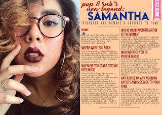
6. Continuing on, I decided to add a label that says "Exclusive" on the top right of the page to catch my target audience's attention and I made sure its colour is bright and different from the rest.


7. Before adding the finishing touches, I thought of changing the house style of my DPS. I tried changing the colours to pastel and the fonts into more calligraphic. However, it doesn't match the theme and genre of my magazine. Moreso, I am wary that my target audience will not like the concept so I reverted back to my original idea.


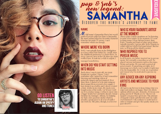
8. To finish off my magazine, I added a sidebar that shows further information about the artist/model. I made sure to put this at the bottom of the main image in order to be less distracting to the reader and to look more professionally organised and eye-catching.
9. Finally, I added the page numbers and other information at the top and bottom page. Below is the final double page spread of my magazine. I am contented with the outcome of the DPS and have made decisions that will appeal to the genre and target audience of choice.


Nina
31.03.17

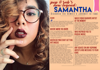
Making of DPS

Hello!

The following is the process of creating my double page spread and what I had to consider as a result of the final product. I will be splitting the process into two posts.

1. Below is the final image I decided to use as the main image of the page. The reason for choosing this is because the image shows a very feminine side of the person being interviewed and because my target audience is mostly female.
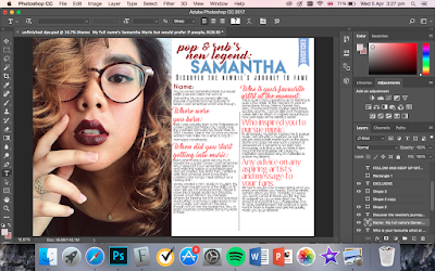
2. For my double page spread, I decided to have the picture on the left-hand side and the whole interview or text on the right-hand side. This way it is organised and the text can be easily read rather than having the text surround the image. Also, I chose a pale orange colour for the background since it correlates with the model's hair highlights.


3. For the header, I used different fonts to show variety. Below are the fonts I used:


I used a calligraphic font for the topmost title as it is classy yet eye-catching and it also stands out from the rest of the other fonts I have used. The colour red matches the model's lip colour showing coordination and consistency in house style.


For the main part of the header, I used a bold font and made the font size bigger in order to pop put from the rest and to make a statement that this is the main topic. Blue is a primary colour that goes with the colour red and is featured in the front cover of the magazine as well. Again, maintaining consistency.


I chose a less sophisticated and bold font for the description part of the header since I wanted the centre of attention to be on the first two titles.
Because this serves as a tagline for the main header, the small condensed font and grey font colour reflects this.

4. For the whole text, I kept it simple by using fonts that are less eye-catching.
   On the left is what the double page spread looks so far after all the tweaking and considerations.5. In order for the body text to be separated from the header and to look more organised, I added lines in the middle, top and bottom (as shown below).I made sure to begin the body text with a drop cap and as I stated in my previous post, this makes it more stylish and attractive.


The continuition of this post will be posted next and up next will be the final touches and the final product.

Nina
31.03.17

Friday, 10 March 2017

Making of Magazine Cover & Final Cover

Hello!

The following would be the process or the making of my magazine cover and how I decided with the finished product.

Powered by emaze


Nina
10.03.17

Thursday, 9 March 2017

Double Page Spread Mock-Up

Hello!


This is a rough idea of what I want my double page spread to look like. Although it looks a bit dull, I will make it as enticing as it can be by adding an image or two and maintain the colour scheme.

Nina
10.03.17


Wednesday, 8 March 2017

Mock-Up for Front Cover

Hello!


This is a rough template of what I envision my front cover to look like. For the coverlines, I will include new articles about artists, freebies,etc. 


Nina
08.03.17

Tuesday, 21 February 2017

Cover Photo for Magazine

Hello!


After a few considerations, I decided to use another model for my magazine cover and have chosen possible pictures to use. I have also invested in using a DSLR camera instead of an iPhone to obtain the best quality. Below are the best 3 samples I took and the chosen photo for my magazine cover will be the last to be explained. 


This is the first option for the cover photo. As mentioned in the first magazine draft feedback, I decided to use a new model for my magazine and as a result, i have succeeded in choosing the right model. She has captured the essence of what an RnB/ Pop genre. Although this first picture could be a good option, I wanted her to look fiercer and communicate with the audience through gestures.


I did not like this second option because I felt that the model looked awkward and unproportionate. However, I do like how it makes the model seem intriguing.The black clothing does not fit with the convention of Pop/RnB being upbeat and lively. This would perhaps fit in a rock or indie magazine but I would not use this is the cover image.


Above are the two out three of the best ones I took, however, I have decided on one that perfectly fits the genre and definitely appeal to my target audience. Below is the photo I decide to be the cover photo.The reason why I chose them is that the model's positioning reflects the magazine's genre. The hand over the shoulder makes the model seem delicate yet the fierce gaze contrasts this idea following the convention of a Pop/RnB being fierce and engaging. Although it could be argued that the glasses could detract attention, I think that this could convey an idea of what the model's story is about since she is the main subject of the magazine. The reason for choosing a white cream coloured shirt is for the audience to focus more of their attention to the model's face. Overall, I am satisfied with the final photo I will be using for my magazine.


Nina
21.02.17

Monday, 23 January 2017

First Magazine Draft

Hello!

After going through the results from my questionnaire, I have created a first draft of my magazine cover that I think conforms to my target audience.


One thing that I mostly focused on is the bright coloured font I have used for this draft. This is because 70% of my target audience said that it would be likely for them to buy a magazine cover with bright coloured fonts. In this case, I used different shades of blue since blue is a bright youthful colour representing my target audience which are young adults.

In order to look for improvements, I will ask my target audience to give in feedback to specifically know what I need to improve on.

Nina
23.01.17

Friday, 2 December 2016

Lifestyle Questionnaire

Hello!

For the next task, we need to create a Lifestyle Style Questionnaire and get 10 people who conform to our Target Audience to complete the questionnaire. I made sure the questionnaire is as clear and concise as possible in order for my audience to give me comprehensive answers I can base my research on. Below is the questionnaire I think would conform to my target audience.


Nina

02.12.16