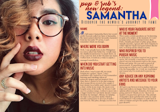
On the previous post, I talked about the first few processes of the making of the DPS and now I will be continuing on and showing the final outcome at the end.
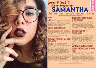
6. Continuing on, I decided to add a label that says "Exclusive" on the top right of the page to catch my target audience's attention and I made sure its colour is bright and different from the rest.


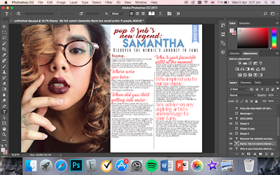
7. Before adding the finishing touches, I thought of changing the house style of my DPS. I tried changing the colours to pastel and the fonts into more calligraphic. However, it doesn't match the theme and genre of my magazine. Moreso, I am wary that my target audience will not like the concept so I reverted back to my original idea.

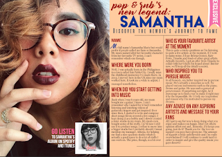
8. To finish off my magazine, I added a sidebar that shows further information about the artist/model. I made sure to put this at the bottom of the main image in order to be less distracting to the reader and to look more professionally organised and eye-catching.

9. Finally, I added the page numbers and other information at the top and bottom page. Below is the final double page spread of my magazine. I am contented with the outcome of the DPS and have made decisions that will appeal to the genre and target audience of choice.
Nina
31.03.17

No comments:
Post a Comment