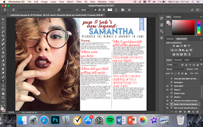
On the previous post, I talked about the first few processes of the making of the DPS and now I will be continuing on and showing the final outcome at the end.
6. Continuing on, I decided to add a label that says "Exclusive" on the top right of the page to catch my target audience's attention and I made sure its colour is bright and different from the rest.
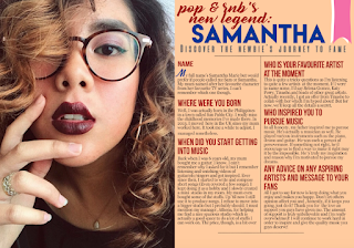
7. Before adding the finishing touches, I thought of changing the house style of my DPS. I tried changing the colours to pastel and the fonts into more calligraphic. However, it doesn't match the theme and genre of my magazine. Moreso, I am wary that my target audience will not like the concept so I reverted back to my original idea.
8. To finish off my magazine, I added a sidebar that shows further information about the artist/model. I made sure to put this at the bottom of the main image in order to be less distracting to the reader and to look more professionally organised and eye-catching.
9. Finally, I added the page numbers and other information at the top and bottom page. Below is the final double page spread of my magazine. I am contented with the outcome of the DPS and have made decisions that will appeal to the genre and target audience of choice.

Nina
31.03.17


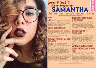
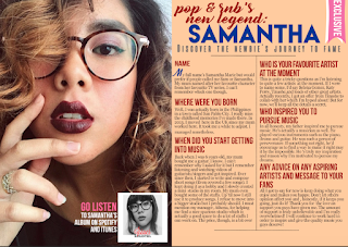
 On the left is what the double page spread looks so far after all the tweaking and considerations.


